In late 2008, my employer wanted to put out an ad after the market had seen some serious tumbling. I worked closely with our marketing consultant who recommended a simple, text based message to customers and potential customers.
Despite working at a global organization, I was surprised to learn that my ad made an impression in a foreign market and that there was a big name publisher who wanted to translate the ad into the local language and run it in their magazines! This was my first job out of college, after all and the first time my work was translated into a foreign language.
Seeing the ad in Japanese so that it may appear in Nikkei's business publications was an a unique thrill and I'm proud to see my work make it's way around the world!
September 26, 2011
September 20, 2011
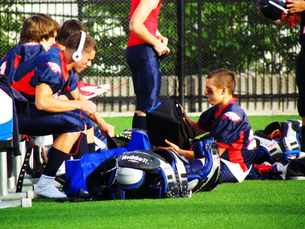
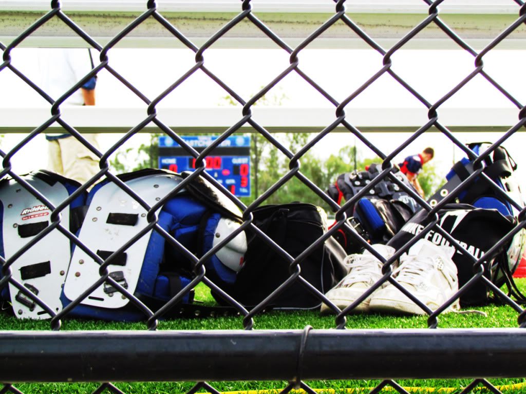
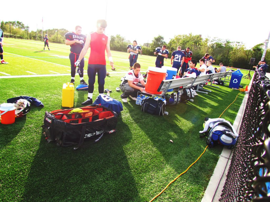
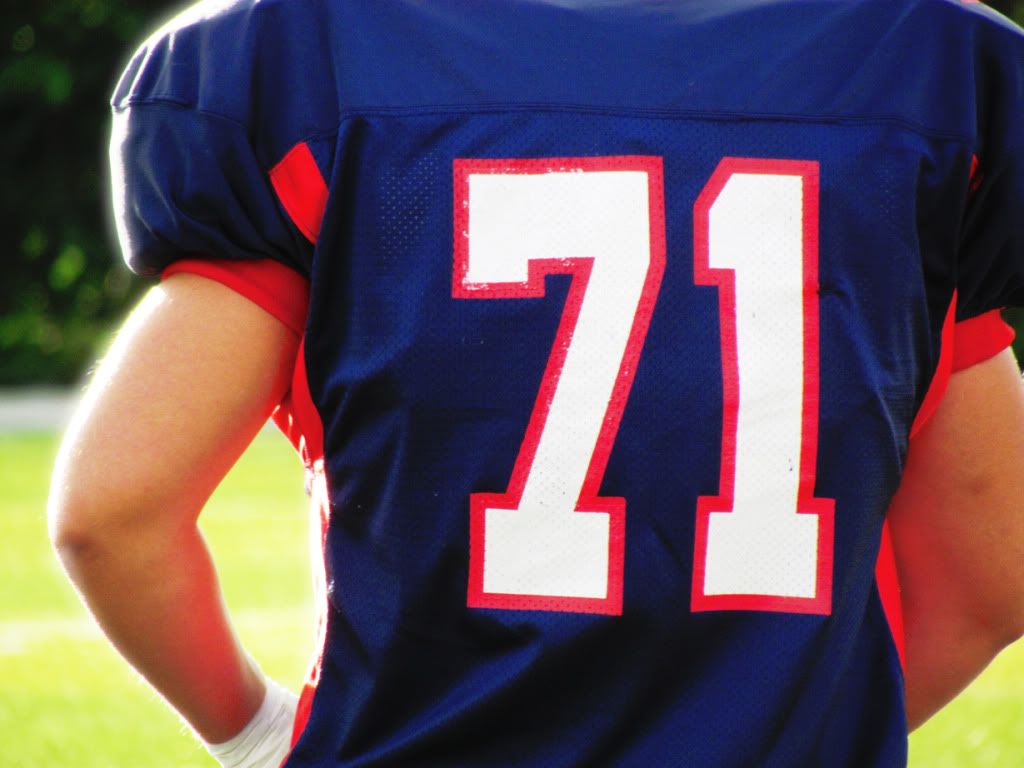
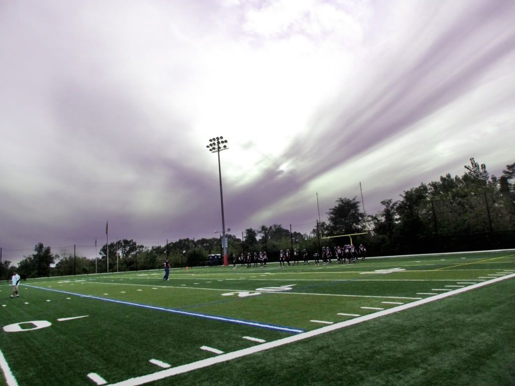
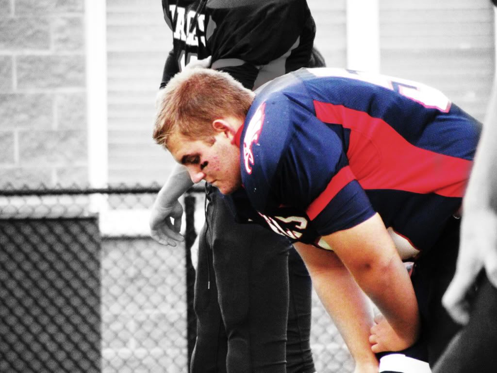
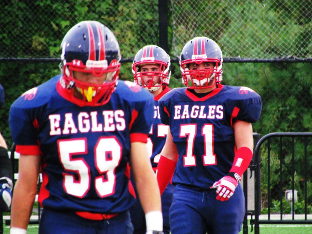
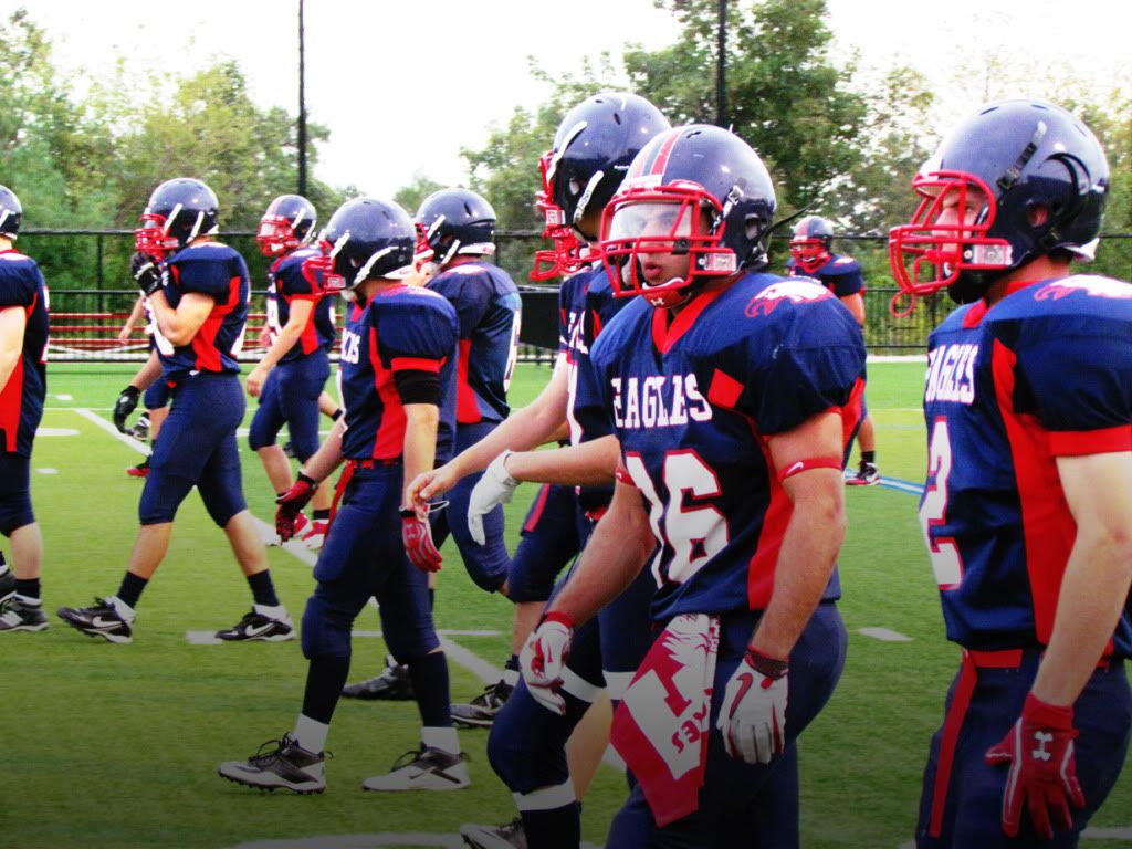
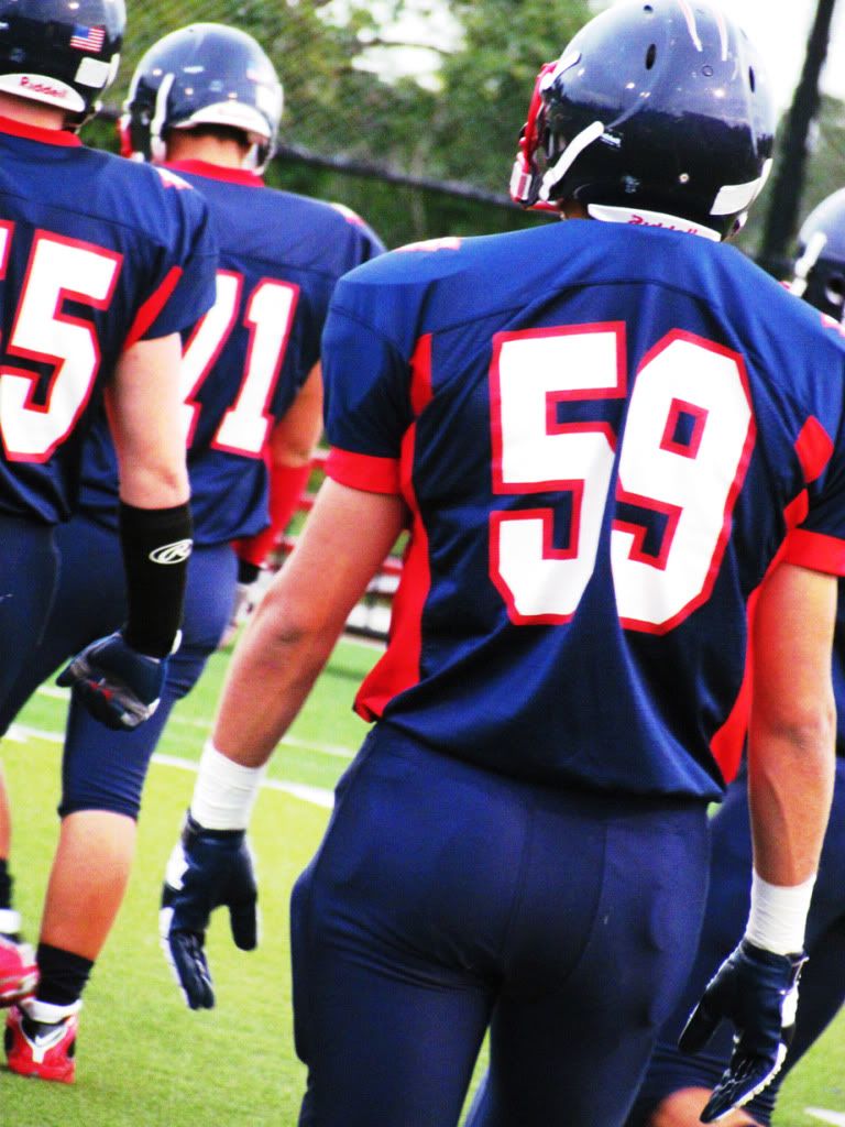
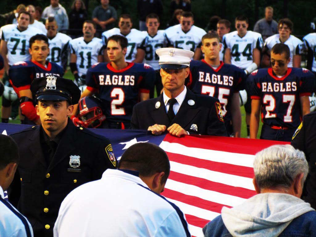
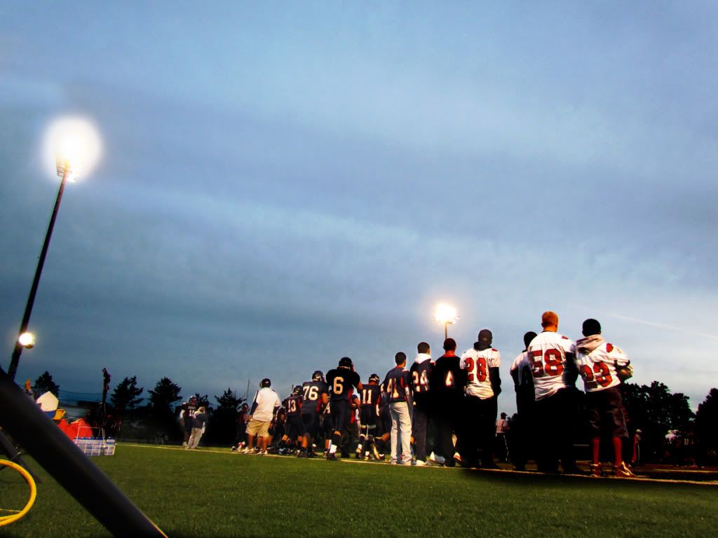
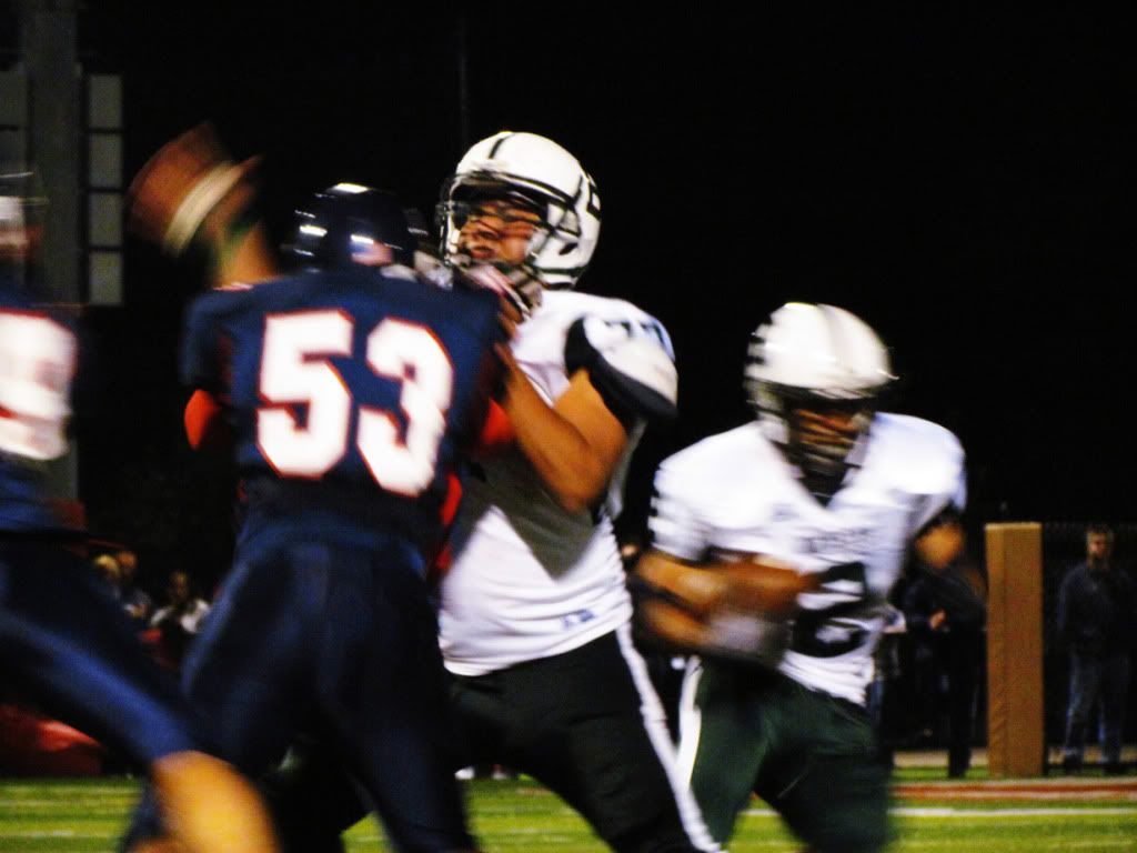
Eastchester vs. Brewster - High School Football [9-16-11]
I really love the summer and I'm always sad when the leaves start changing colors here in New York. Thankfully, the dull ache in my heart is eased by the knowledge that it's football season and there's plenty to be excited about.
Below you can find some photo's I took before a high school game between two local schools. If you like what you see, be sure to click here to view all the photo's from the pre-game and a few from the game itself.
Below you can find some photo's I took before a high school game between two local schools. If you like what you see, be sure to click here to view all the photo's from the pre-game and a few from the game itself.
September 14, 2011
DJMG
Recently, I was handed the business card for a DJ. Not long after this my head hurt. This was because the design on the back of the business card was not conducive to viewing while not under the influence of some kind of substance.
Now this could sound like a bad thing to some, but not to me. Moments like this just get my creative juices flowing and I tried my hand at creating a new design for him.
FYI - don't try a google search for DJ MG. You're just gonna find the wrong guy :)
Now this could sound like a bad thing to some, but not to me. Moments like this just get my creative juices flowing and I tried my hand at creating a new design for him.
FYI - don't try a google search for DJ MG. You're just gonna find the wrong guy :)
September 12, 2011
Michelle, Peter, Racquel and Danielle
Photography is an altogether different beast than design and video. In some ways, it's an odd hybrid of the two.
Many of the same principals apply with regards to space and just like video, after the image is captured the work has only just begun. Below are some examples of photo's with several varying visual effects applied to them. All photo's below were taken and edited by me during a family portrait shoot with my cousins Michelle, Peter, Racquel and Danielle.
As with all image's on this blog, you can click for a larger version.
 |
 | ||
|
 |
| And finally, the family walking off down the beach to cap it all off. |
September 8, 2011
Legion Ale
When I was asked by a friend to design the label for a basement brew called "Legion Ale," there was no way I could turn it down. Of course, I wouldn't be a very good beer lover if I didn't accept without trying it...
The middle of the circle was intentionally left blank so the owner could insert his own image in there which had not been determined at the time of completion.
The middle of the circle was intentionally left blank so the owner could insert his own image in there which had not been determined at the time of completion.
I'm A Knicks Fan
I really love sports. While I didn't always love them all, for as long as I could remember I've been a Knicks fan. Below you can find three pieces that I've done as a fan of the team.
These two stills were done before I went to a meet and greet with the respective players. They were good enough to autograph them for me. I was actually pretty flattered when they took a moment to stare at the images and were impressed with my work.
This highlight video, however, is much more recent. I slapped it together in a haze of excitement as the first Knicks playoff appearance in years was on the horizon. I hope you enjoy!
September 6, 2011
Corporate Work
From slides, to postcards, to web ads. The corporate world requires a wide variety of design elements and I feel safe saying that I've experienced them all. Below are a few examples of design that I've done within the corporate world.
 |
| This image was used as a poster to greet guests at an event celebrating the achievement of women in business. |
 |
| Pamphlets like the one above can be a great way to communicate information about your company in an organized and efficient manner. Works well on its own or as part of a larger media package. |
September 5, 2011
Gearheads Trailer
September 3, 2011
A Tree Grows
One day, a former co-worker of mine was consulting me on what kind of design she wanted for an upcoming project. Everything she mentioned had to do with trees or plants. The final design did not reflect this favored idea of hers, but I saw fit to go back and create something specifically for her. Voila!
September 2, 2011
Only In Dreams
Subscribe to:
Posts (Atom)


